I remember waking up groggy in the back of a Cathay Pacific Boeing 777. Where was I and how had I ended up here? Then it dawned on me. I had fallen asleep in my seat at the back of the plane shortly after take-off. The glow emanating from the inflight map was the only thing vaguely illuminating my surroundings. According to the map we had made some progress since I closed my eyes somewhere over Chongqing. The outline of the aircraft on the screen now appeared closer to a place called Ulaangom (a city in Mongolia). At this stage in the flight, tired and cramped, the basic cartography of the inflight map felt more like an abstract projection of place, space and time than anything with a relationship to the world outside my window.

American Overseas Overseas Plotting Chart from 1945
What you might not know is that the inflight map started on paper. The American Overseas Airlines maps reproduced above from 1945 enabled passengers to plot the progress of their own flights. Every so often the pilot would update them on where they were, either giving them longitude and latitude coordinates or a distance from a city or landmark. They would then mark that location on the map and, as the flight progressed, chart the route. The plotting chart shared with passengers was a simplified version of the one used by the pilots for navigation. The map was printed on high quality, almost parchment-like uncoated paper, which made writing on it easy. It is heartening to see an airline so early on share the incredible nature of what they were doing, the novel experience of crossing oceans and continents in hours, not days as would otherwise have been the case at the time.

For decades these were the sort of maps we could find embedded in the seat in front of us. Rudimentary but somehow they also made you feel truly disconnected from the outside world.
Over the next few decades the inflight map evolved radically. A system called Decca, which had originally been developed for maritime use soon migrated into the cockpit. Decca was a hyperbolic radio navigation system which allowed aircraft to determine their position by receiving radio signals from fixed navigational beacons. It consisted of multiple parts, including one of the very first mechanical moving maps. Early versions of the system were installed on board B.O.A.C Trident aircraft. Before any flight an automatic roller would be pre-loaded with a paper map of the route the pilot was about to fly. As the flight progressed, the roller would advance the map and a pen would draw a line on it. A bit like how a heart monitor continuously prints out a heartbeat on a narrow, pre-printed graph in real-time. The position of the pen was adjusted automatically by the onboard computer, which would take into account the heading that the aircraft was flying, speed, wind and other factors. It was thus able to automatically plot the location of itself throughout and draw the route it was flying. The system was, however, incredibly cumbersome.

Modern inflight maps move around a lot. Smooth panning across the world. Simulate the flight before you've left the tarmac.
Around the same time, the first screen-based moving maps were installed as a ‘compact navigation device’ and tested in the cockpit to aid navigation by Pan American World Airways on their Boeing 707. According to the New York Times at the time: “The device receives bearing and distance information by radio signal from Federal Aviation Agency stations. These signals automatically move the bug under the map as the path of the aircraft changes.”
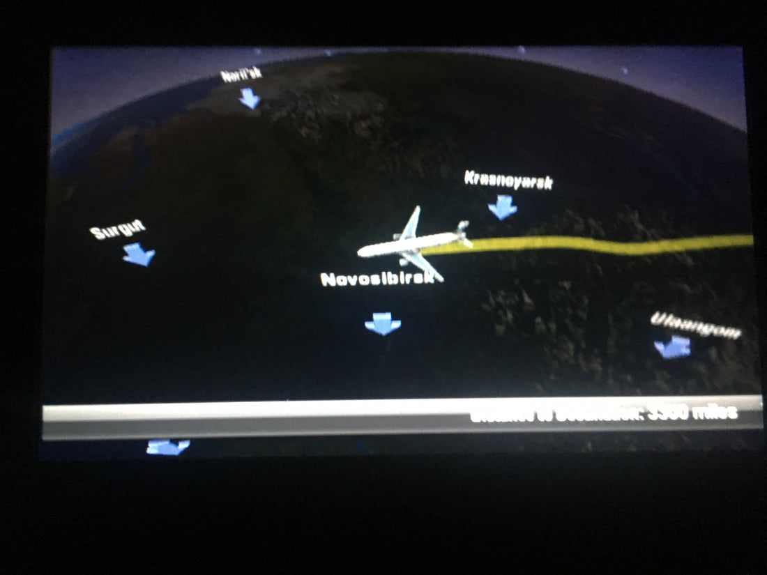
The inflight map that greeted me after waking up was first introduced to passengers by Swissair and KLM in 1982. Before screens were embedded into the seat back, they were projected onto a canvas in the cabin. The maps were quite crude compared to what we experience today, low resolution and with little detail. A thick red line would trace the route of your flight from departure to destination across an almost featureless world. On top of the line a generic aircraft shaped object would slowly move along drawing behind it a virtual contrail.
Over the decades the inflight map has increased exponentially in visual ability and complexity, now showing city names and points of interest, popping in and out of focus as the journey progresses. It now gets its location by satellite and provides an increasingly connected experience. The latest versions display a 3D representation of the flight path, beautifully animated as it whizzes over whole continents in seconds. It even allows us to mimic what the pilot sees, with airspeed, altitude and detailed digital overlays, a game-like interface where the objective appears to be to land safely.
The inflight map or the moving map is now a platform for entertainment and education, competing directly for our engagement with Hollywood’s latest output. What’s reassuring from a map-making point of view is that the inflight map remains a hugely popular part of the inflight entertainment system even when there are now enough box sets available to safely provide every passenger with a different experience. People still want to see where they are going and what they are flying over. The fundamental need to know where you are, especially when you cannot alter the direction of travel, remains.
If you start your first flying lesson tomorrow you might reasonably expect that you will be navigating by something closely resembling the technology accessible on your phone. It couldn’t be further from the truth. All aviators learn to navigate first and foremost by pen and paper. Routes are drawn on a map with a ruler. Fuel consumption, wind direction, distance and duration are calculated by hand. There is something reassuring about the analogousness of it all, that if the digital elements fail you will be ok, the paper map is there to save the day.